



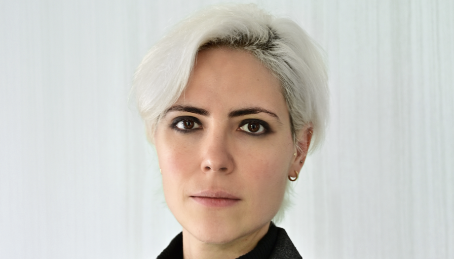
María del Mar Chapa studied Communication and did a professional master's degree in Communication Business Management. She is a founding partner of Malinche Studio and states emphatically that “design goes far beyond aesthetics”.
This artist and entrepreneur sees design as “a tool to make ideas connect better with people, to make messages clearer, more human and closer to them”. Perhaps because of this vision, she has been in charge of designing the logo of the Pope Leo XIV's trip to Spain, He talks about this project in this interview with Omnes.
What was the main inspiration for designing the logo for Pope Leo XIV's trip to Spain? What message do you want to convey with it?
- The main inspiration was the slogan itself: “Raise your eyes”. From the beginning I understood it more as a gesture than as a phrase. I thought a lot about the idea of looking up together, of a community that does not stand still, but moves forward united towards something bigger.
That's why the logo has this upward movement and these human figures linked together. More than just representing places or religious symbols, I was interested in conveying a sense of community, accompaniment and shared hope.
At its core, I think the message of the logo is quite simple: when people walk together and look up, they can generate something much bigger than themselves.
How was the creative process from the initial idea to the final version of the logo?
- The process started long before designing shapes or colors. First I needed to understand what this visit really represented and what emotion it should convey. I was very clear that I didn't want to make a collage of recognizable symbols, but to build an image that felt alive, coherent and human.
From the slogan I started to work on the idea of the open circle, because visually it speaks of community and union, but at the same time, being open, it also transmits welcome, movement and continuity. Then came the human figures, which support each other and generate this sensation of collective impulse upwards.
Later on I integrated the different territorial elements and the Marian figure, always trying to make everything part of the same visual language. The great challenge was to find a balance: that the logo had symbolic depth, but at the same time was clear, simple and easy to recognize.
What is the meaning of the colors and symbols chosen?
- Each element has a well thought out meaning within the whole. The human figures represent community, bonds and mutual support. They are not isolated individuals, but a network of people moving forward together.
The Marian figure in the center functions as the heart of the logo. It does not seek to represent a specific invocation in a literal way, but rather to convey a more universal idea of protection, care and accompaniment.
The sea, especially related to the Canary Islands, also has an important symbolic charge. Beyond the geographic, it speaks of a path, of transit, of hope and also of many human realities that are part of our present.
And as for color, the idea was to reflect diversity without losing unity. Each color brings identity and energy, but they all coexist within the same structure. I wanted the visual system to feel bright, close and contemporary.
What are the challenges of creating a logo that has to represent an event of international and religious relevance?
- I think the main challenge is to find a balance between the symbolic and the human. An event like this brings together so many different sensibilities, both cultural and spiritual, and the challenge is to create an image that can connect with very different people without losing depth.
It was also important to avoid the logo feeling too rigid or institutional. I wanted it to have a clear spiritual reading, but at the same time speak of something universal: community, hope, encounter and accompaniment.
And, of course, there was the challenge of integrating many elements without making it look like a sum of separate pieces. Everything had to feel part of the same movement.
How did you decide on the visual style of the logo: more traditional, modern or a combination, and why?
- I would say it is a mixture of both. There are very traditional elements in the meaning (such as the Marian figure or the idea of pilgrimage and community), but worked from a much more contemporary and accessible visual language.
From the beginning I wanted to move away from certain codes that are too solemn or rigid that usually accompany this type of events. I was interested in building something closer, brighter and more human, especially thinking about how people communicate visually today.
That is why the design has organic shapes, a lot of movement and a quite dynamic composition, but without losing the symbolic and spiritual weight it represents.
How do you make a graphic design communicate ideas as profound as faith and spirituality without losing simplicity and clarity?
- I think the key is to go to the essential. When a design tries to explain too much, it usually loses power. On the other hand, when you find a clear and honest idea, you can connect in a much deeper way.
In this case, rather than representing religious concepts in a literal way, I was interested in conveying emotions and human gestures that we all recognize: mutual support, hope, walking together, looking up.
For me, simplicity does not mean that there is less meaning, but quite the opposite: it means that the message manages to get through in a more direct and more human way.


 Español
  English
  Italiano